Spring Sale | 50% Markdowns
ALL SALES FINAL.
*This promotion excludes Mother's Day Collection, Spring Refresh Collection, rugs, lighting and furniture.

$10 Shipping on All Ready-to-Ship Items.
*This promotion excludes Mother's Day Collection, Spring Refresh Collection, rugs, lighting and furniture.

SPRING REFRESH

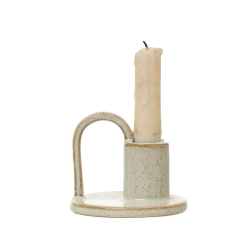
COOKING + ENTERTAINING

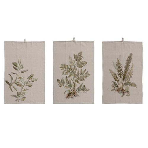
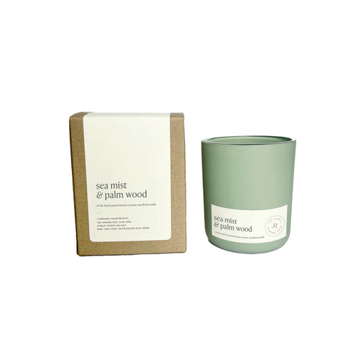
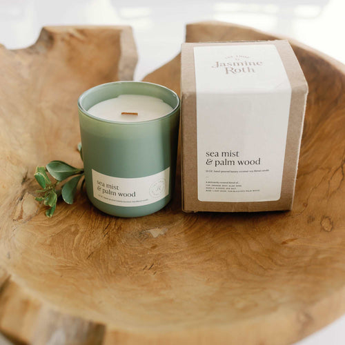
DÉCOR

LAST CHANCE: UP TO 50% OFF